Philippines "Forecast" vs Actual Deaths for 2020, Updated 2021 Deaths (to September 2021)
PSA publishes updated 2020 Death Data, showing 2020 deaths are 2% lower than Forecast. 4th Quarter 2021 Data is still pending. However 2021 data far exceeds forecasts, and trends are not reassuring!
When studying population death data as in indicator of an infection or intervention outcomes, it will be useful to use standardized methods, which include accommodation for natural population growth and normal monthly patterns.
This article updates the previous assumptions where 2019 was taken as the last normal year; I have now updated my estimated following the guidelines set by Adair, Lopez, et al. to arrive at an expected annual deaths forecast based on historical trending.
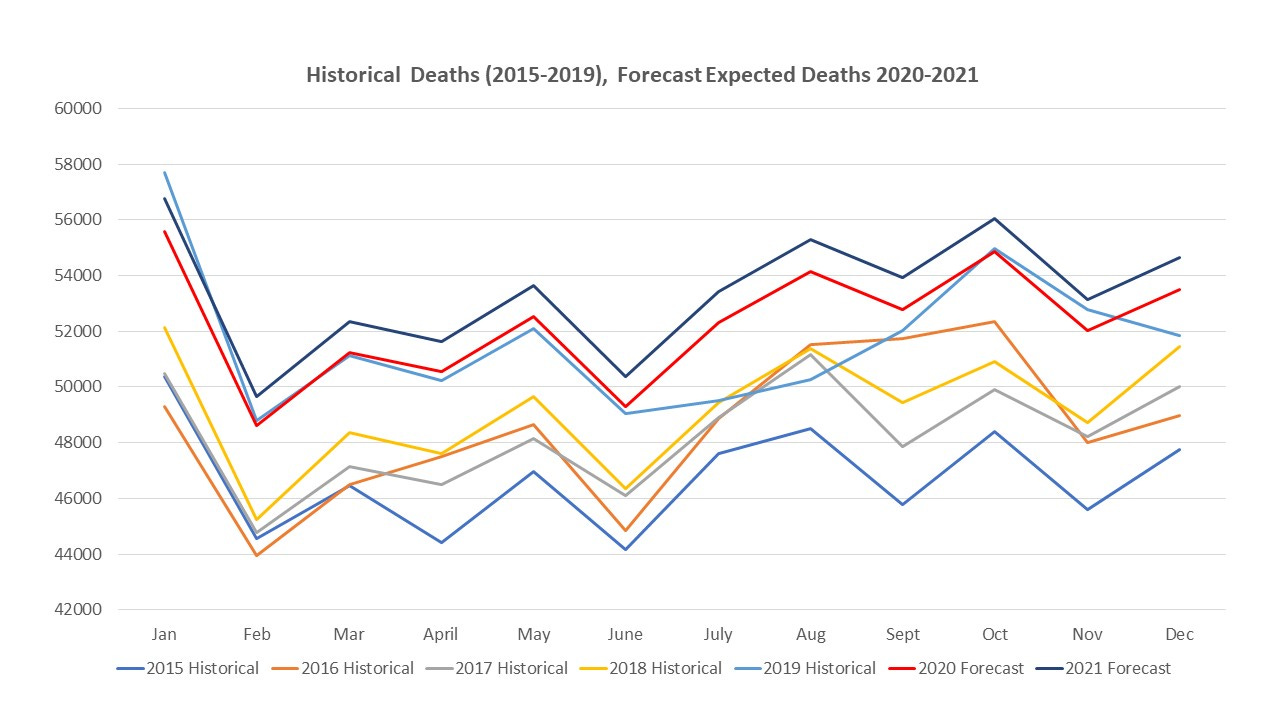
This approach uses 5-year historical data and the Excel Forecast Function, to come up with probable deaths (and provides upper and lower expected ranges). The forecasts for 2020 and 2021 are shown below. Using this “Forecast” approach results in slightly lower excess deaths (by a few thousand) vs. my previous comparison with 2019.
Actual 2020 deaths were updated by PSA on 31st of January 2022 and are also input in red. It may be observed that 2020 registered deaths were about 2.2% lower than the predicted excel forecast; close to the lower range.
Typical 5-year historical monthly deaths patterns are shown in the figure below. These were used to distribute the forecast deaths for 2020 and 2021 across each year.
The 2020 and 2021 forecast lines are higher than previous lines, reflecting the forecast trend of increasing death rates with increasing population size / changes in demographics. The raw data for this figure are set out in the first part of the table below.
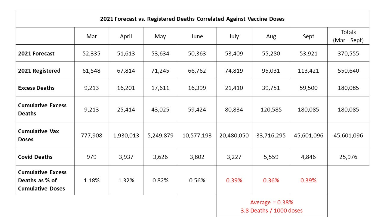
It can readily be observed in the second part of the following table that 2020 deaths were lower than expected, while 2021 deaths were far higher than expected.
I take passing note that 2021 excess deaths jump in February. I am curious with regards to a recent MD comment that there was some unofficial delivery of vaccines starting in February, prior to the official start in March. It would be interesting and useful if that unofficial rollout could somehow be quantified and considered in this assessment.
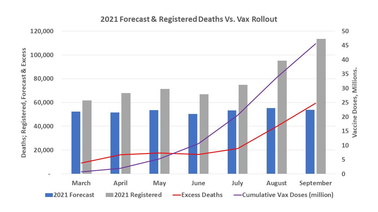
Considering the initial 1 year lockdown period from March 2020 to February 2021, as shown in the figure below, we do not see excess deaths; it is likely that the death causing disadvantages of lockdowns and covid infections were being more than offset by other causes of death which were prevented.
Referring back to the forecast; if the upper bound of the 2021 prediction of 655,319 is used, we would have expected only 487,776 deaths up to September 2021. There is still an excess of 173,444 persons no longer with us and whose deaths demand and deserve explanation.
Using the Forecast method, I revised my correlation of cumulative excess deaths against cumulative vaccine doses and came up with a slightly lower relationship. Still 3.8 excess deaths per 1000 doses. However, the September data is not yet complete and the last quarter for 2021 is still pending; with another update expected within the next 2 weeks. It remains to see whether this relationship changes over time, and particularly whether the introduction of booster doses of vaccines in November 2021 further pushes registered deaths in any direction.
I can only report on observed trends; conclusions for cause are pending.
Despite my caution in not drawing a conclusion of cause, the trend of rapidly increasing excess deaths over time with no natural explanation being readily seen, is highly alarming and needs urgent attention and action.


